
Widget Integration
Embed a real-time AI voice avatar (WebRTC lipsync video, with an audio-only fallback) into any web page. Available as an npm package for vanilla JS and React, or as a CDN script tag. This page covers every configuration option, feature flag, event, and integration pattern the widget supports.
⚠️ Important Security Notice
- • Never use your API key directly in client-side code - This exposes your key to anyone who views your page source
- • API keys in JavaScript are NOT secure and not recommended for production
- • Always use server-side session tokens for widget authentication in production environments
For production deployments, create a backend endpoint that mints session tokens, call it from your frontend, and let the widget authenticate with that session. Never expose your actual API key to the client.
Overview
The widget handles the session WebSocket, microphone capture, lipsync video, and the entire on-screen UI. It is framework-agnostic, with a thin set of React bindings published alongside it.
| Package | Use it for | Entry point |
|---|---|---|
| @konpro/widget | Vanilla JS, any framework. Ships ESM, CJS, a CDN IIFE build, and TypeScript types. | import { init } from '@konpro/widget' |
| @konpro/widget-react | React 17+. Provides <KonproWidget> and <KonproBubble>. | import { KonproWidget } from '@konpro/widget-react' |
| CDN bundle | No build step. Loads from https://cdn.konpro.ai/widget/index.min.js. | window.KonproWidget |
| @konpro/js-sdk | Server-side. Mints the short-lived session tokens your endpoint hands the widget. | import { KonPro } from '@konpro/js-sdk' |
- Version: check
KonproWidget.versionto see what is deployed. - Bundle size: ~418KB minified for the CDN build. Panorama (~800KB) and Google Maps (~500KB) load only on first use.
- SSR-safe: the module entry sets no globals and touches no DOM at import time, so it is safe to import under Next.js or Remix — just call
init()on the client.
The KonAI global still works
The widget was originally published under the global KonAI. window.KonAI remains and points at the same object as window.KonproWidget, so existing embeds keep working unchanged. New integrations should use KonproWidget; the alias will only be removed at a future major version.
What the widget looks like
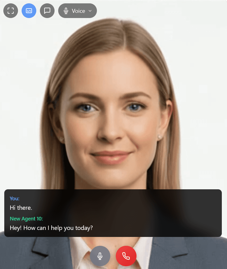
The widget mid-call, with most of the optional chrome switched on:
- Top-left button row — fullscreen, captions (highlighted while the transcript is showing), text input, and the opt-in
inputModedropdown, currently set to "Voice". - Avatar stage — the lipsync video, framed by
videoFitandvideoPosition. - Transcript panel — the scrolling user/AI exchange overlaid across the bottom of the stage.
- Bottom control row — mic mute, and the call button in its red connected state.
Where the avatar itself is configured
This page documents the widget — how the avatar is embedded and how the on-screen UI behaves. The avatar behind it (persona, prompt, voice, knowledge base, display library, tools) is configured in one of two places, and both drive the same agent:
- KonPro Studio — build and tune the agent visually at studio.konpro.ai. Pick or upload an avatar, assign a stock or cloned voice, write the persona, attach a knowledge base, fill the Display Library, and enable tools on the Tools tab.
- API / SDK — do the same programmatically when you need to provision agents per customer or per tenant: manage avatars and sessions through the KonPro API, set limits and
allowed_domainsvia Create Widget Session, or build a custom front end with the KonPro JS SDK when the widget isn't the shape you need.
For a guide-level walkthrough of embedding an agent, see Embed an Agent in Your Site.
Quick Start
The minimum viable embed, with no build step. Everything else on this page is optional configuration.
<div id="konpro-avatar" style="width:400px;height:600px"></div>
<script src="https://cdn.konpro.ai/widget/index.min.js"></script>
<script>
  KonproWidget.init({
    sessionEndpoint: '/api/widget-session',
    containerId: 'konpro-avatar',
  });
</script>
Three moving parts:
- A
<div>on your page where the widget mounts. - The CDN
<script>tag. KonproWidget.init({...})with an auth method — your backend's session endpoint already knows which avatar to use.
Agent Skills
If you build with a coding agent, install the Konpro Agent Skills and it can wire up a complete integration — the client embed and the server-side session endpoint — without rediscovering the failure modes that make the two halves disagree.
npx skills add koninfotech/konpro-skills

# Installs into whichever agents you have — Claude Code, Cursor, Codex,
# Copilot, Gemini CLI, opencode and others. Project scope by default; -g for global.

# Claude Code plugin marketplace, alternatively:
#   /plugin marketplace add koninfotech/konpro-skills
#   /plugin install konpro-skills@konpro
Then just ask your agent something like "Add an interactive avatar to our support page."
| Skill | What it does |
|---|---|
| konpro-widget-integration | Mount the widget (vanilla JS or React), implement the session endpoint, configure CSP and microphone permissions, and debug connection, token, worklet and mic errors. |
| konpro-avatar-setup | Get from zero to credentials: API key, listing and creating avatars and agents, and finding the agenticAvatarId a session binds to. |
They are separate on purpose — provisioning an avatar does not load the integration skill, and vice versa. The skills carry the decisions and failure modes rather than the option tables, and link back here and to the package READMEs for those.
Verify an integration
The integration skill ships a checker that POSTs what the widget posts and reads the response the way the widget reads it — above all confirming avatar.id is present. It exits non-zero on failure and never prints the token.
node skills/konpro-widget-integration/scripts/verify-integration.mjs http://localhost:3000/api/widget-sessionSource and full documentation: github.com/koninfotech/konpro-skills.
Installation
Two delivery options. They run the same engine, so every configuration option below applies to both.
npm
Use this when you have a build step. Ships ESM, CJS, and TypeScript types.
npm install @konpro/widget          # vanilla JS
npm install @konpro/widget-react    # React bindings
The vanilla package exports an init() function that returns the widget instance:
import { init } from '@konpro/widget';

const widget = init({
  sessionEndpoint: '/api/widget-session',
  containerId: 'konpro-avatar',
});
For React, install @konpro/widget-react instead and use the components — see . It pulls in @konpro/widget automatically.
Script tag (CDN)
No build step. Once the script runs, the global KonproWidget is available and KonproWidget.init(config) returns the widget instance — hold on to it if you want to call any of the later.
<!-- Add to the <head> section or before the closing </body> tag -->
<script src="https://cdn.konpro.ai/widget/index.min.js"></script>
<script>
  const widget = KonproWidget.init({ /* config */ });
</script>
Authentication
The widget needs a short-lived session token to open its WebSocket. Choose exactly one method — passing none throws at init().
Option A — sessionEndpoint (Recommended for production)
Your backend mints the token, so your API key never reaches the browser.
Frontend - Point at Your Endpoint
KonproWidget.init({
    sessionEndpoint: '/api/widget-session',
});

// The widget POSTs { audioOnly } and expects the full session object back.
// Do NOT add agenticAvatarId here — the session token already determines
// the avatar, and passing it masks a broken endpoint (see below).
Backend - Mint the Session
Use @konpro/js-sdk, the server SDK. Keep KONPRO_API_KEY server-side — never prefix it with NEXT_PUBLIC_, VITE_, or anything else that reaches the client.
// backend/api.js (Express) — npm install @konpro/js-sdk
import express from 'express';
import { KonPro, KonProError } from '@konpro/js-sdk';

const app = express();
app.use(express.json());   // required, or audioOnly silently defaults

const konpro = new KonPro({ apiKey: process.env.KONPRO_API_KEY });

app.post('/api/widget-session', async (req, res) => {
    const { audioOnly = false } = req.body ?? {};

    try {
        const session = await konpro.widget.createWidgetSession({
            widgetSessionCreate: {
                agenticAvatarId: process.env.KONPRO_AGENTIC_AVATAR_ID,
                allowedOrigins: ['https://www.example.com'],
                audioOnly,
            },
        });

        // The complete payload. No field picking.
        res.set('Cache-Control', 'no-store').json(session.data);
    } catch (error) {
        if (error instanceof KonProError) {
            // Log server-side; never return error.message to the browser.
            console.error('Konpro session failed', error.code, error.requestId);
            return res.status(502).json({ error: 'Could not start a session' });
        }
        console.error(error);
        res.status(500).json({ error: 'Could not start a session' });
    }
});
The same route in Next.js
// app/api/widget-session/route.ts (Next.js App Router)
import { KonPro, KonProError } from '@konpro/js-sdk';
import { NextResponse } from 'next/server';

export const runtime = 'nodejs';        // it is a server SDK, not Edge
export const dynamic = 'force-dynamic'; // a cached response reuses one token

const konpro = new KonPro({ apiKey: process.env.KONPRO_API_KEY! });

export async function POST(request: Request) {
    const { audioOnly = false } = await request.json().catch(() => ({}));

    try {
        const session = await konpro.widget.createWidgetSession({
            widgetSessionCreate: {
                agenticAvatarId: process.env.KONPRO_AGENTIC_AVATAR_ID!,
                audioOnly,
                userMetadata: { visitorId: crypto.randomUUID() },
            },
        });

        return NextResponse.json(session.data, {
            headers: { 'Cache-Control': 'no-store' },
        });
    } catch (error) {
        if (error instanceof KonProError) {
            console.error('Konpro session failed', error.code, error.requestId);
            return NextResponse.json(
                { error: 'Could not start a session' },
                { status: error.status === 401 ? 500 : error.status },
            );
        }
        throw error;
    }
}
Return the whole session object. createWidgetSession resolves to { data, meta } — return session.data untouched. This is the single largest source of integration bugs.
- Never hand-pick fields. A response carrying only
{ sessionToken }looks complete but is not — the widget readsavatar.idfor the WebSocket init message. Dropavatarand the session mints fine, then the socket opens and closes immediately withMissing required fields: token, agenticAvatarId, userId. - Include
expiresAtorexpiresIn. The widget uses them to re-mint before the server's 30-minute TTL lapses. Without them it assumes the token is stale after 25 minutes — safe, but less precise. - Never cache and re-serve a session. Send
Cache-Control: no-store; a cached response hands the same expiring token to every visitor. - Never return the upstream error message to the browser — it can name internal resources. Log it server-side and return something generic.
- Never take the avatar ID from the request body. That lets any visitor bind a session to any avatar in your account. Derive it server-side from tenant, page, or plan.
This route mints billable sessions, so it is public unless you gate it. Authenticate the caller as you would any privileged route, pass allowedOrigins so a token minted for your site cannot be used from another, and rate-limit it.
Option B — getSessionToken (Custom auth flow)
A Promise-returning callback you control. Use this when you need custom headers, alternate auth flows (Cognito, Auth0, etc.), or a token from an existing session. It returns the same session shape as the endpoint above.
KonproWidget.init({
    getSessionToken: async () => {
        const res = await myClient.post('/create-avatar-session');
        return res.data; // same session shape as the endpoint returns
    },
});
Option C — apiKey (Development only)
⚠️ Warning: This puts your Konpro API key in the browser where anyone can read it. Only use it for local prototyping or a walled internal demo.
// ⚠️ NEVER DO THIS IN PRODUCTION - API KEY EXPOSED
KonproWidget.init({
    apiKey: 'YOUR_KEY', // NOT SECURE - Development only
    agenticAvatarId: 'af1250af-...',
});
Do not put agenticAvatarId in client config
It is required with apiKey and should appear nowhere else. With sessionEndpoint or getSessionToken the session token already determines the avatar, and the widget reads the ID from avatar.id in the session response.
Passing it anyway is not merely redundant — it is the last-resort fallback in the widget's avatar-resolution chain, so it masks a session endpoint that has dropped avatar. The integration works until something else changes, and a demo that passes it can run perfectly while a correct, minimal integration fails. Leave it out and a broken endpoint fails immediately, where you can see it.
Configuration Reference
Every option accepted by init({...}), grouped by purpose.
Authentication
| Option | Type | Default | Notes |
|---|---|---|---|
| apiKey | string | — | ⚠️ Development only. Requires agenticAvatarId. |
| sessionEndpoint | string | — | Recommended. Your token-minting endpoint. |
| getSessionToken | () => Promise<SessionData> | — | Custom auth flows. |
| agenticAvatarId | string | — | Required with apiKey. Omit it with the other two methods — it masks a broken session endpoint. |
Layout
| Option | Type | Default | Notes |
|---|---|---|---|
| containerId | string | — | Element ID to mount inside. The widget fills it 100%×100% and you control the size via that element’s CSS. Overrides position. |
| position | object | {position:'fixed', bottom:'20px', right:'20px', width:'400px', height:'600px'} | Floating-mode CSS. Used only when containerId and bubble are both omitted. |
| bubble | boolean | object | — | Bubble launcher mode. See . |
Video & Audio
| Option | Type | Default | Notes |
|---|---|---|---|
| audioOnly | boolean | false | Disable lipsync + WebRTC video. Shows an animated circle with the avatar’s image or initials. Sets the initial mode — guests can change it between calls when showTopButtons.mediaMode is on. |
| enableLipsync | boolean | true | Request server-side lipsync. Degrades gracefully if unavailable. |
| enableWebRTC | boolean | true | Use WebRTC/MediaSoup for lowest-latency A/V. Falls back to audio-only on failure. |
| usePlaceholderVideo | boolean | true | Play the avatar’s idle-loop video between responses. |
| videoFit | "contain" | "cover" | "contain" | CSS object-fit for the avatar video. |
| videoPosition | string | "top" | CSS object-position, e.g. "top", "center", "50% 20%". |
Conversation Behaviour
| Option | Type | Default | Notes |
|---|---|---|---|
| allowInterruption | boolean | true | When false: no barge-in, interrupt button hidden, interruptAI() is a no-op, and text send is refused while the avatar speaks. |
| pushToTalk | boolean | false | Push-to-talk. The mic starts muted and a hold-to-talk button replaces the mute button. |
Integration Keys & Advanced
| Option | Type | Default | Notes |
|---|---|---|---|
| googleMapsApiKey | string | — | Required for the city display tool. Needs the Maps JavaScript API and Map Tiles API enabled, with billing. |
| apiBaseUrl | string | "https://api.konpro.ai" | Override for self-hosted / staging backends. |
| workletUrl | string | auto | Explicit URL for the mic-capture AudioWorklet. Only needed when your CSP forbids both data: and blob: script sources — serve @konpro/widget/dist/mic-capture.worklet.js yourself and point here. |
Theme
The theme option accepts an object:
theme: {
    primaryColor:   '#667eea',  // gradient start (header, avatar, call button)
    secondaryColor: '#764ba2',  // gradient end
    iconSize:       18,         // control-button icon px (mute renders at iconSize - 2)
}
UI Details
uiDetails controls what chrome is rendered. Pass false for a whole group to hide it.
uiDetails: {
    showHeader:     true,        // top bar with avatar name + "Online"
    showStatus:     true,        // Live / Listening / Speaking / Processing pill
    showTranscript: true,        // caption panel
    showAvatar:     true,        // the avatar video/image itself

    showControls: {              // bottom control row
        call:      true,
        mute:      true,
        interrupt: false,        // force-hidden when allowInterruption: false
        audioMute: false,        // speaker mute (WebRTC only)
    },

    showTopButtons: {            // top button row
        fullscreen: true,
        captions:   true,        // hidden anyway if showTranscript: false
        textInput:  true,        // only visible during an active call
        inputMode:  false,       // opt-in Voice ⇄ Push-to-talk dropdown
        mediaMode:  false,       // opt-in Video ⇄ Audio only, between calls
    },
}showControls:falsehides the whole row; an object merges over the defaults, so you only specify overrides.showTopButtonsfollows the same pattern.captionsandinputModeare opt-in — they stay hidden even whenshowTopButtons: trueis used as shorthand.
Callbacks
| Callback | Fires |
|---|---|
| onReady(widget) | Initialisation finished — session fetched, UI mounted. |
| onError(error) | Unrecoverable error (auth, session, socket). Always receives an Error. |
| onTranscription(text) | The guest’s speech was committed by STT. |
| onResponse(text) | The avatar finished a complete response. |
| onAvatarStateChange(state) | Any avatar state transition. |
| onAudioOnlyChange(bool) | Video ⇄ audio-only changed between calls. Not fired for a server override on ready — read getModeInfo() after connecting. |
| onBubbleOpen(widget) | Bubble expanded. Bubble mode only. |
| onBubbleClose() | Bubble collapsed. Bubble mode only. |
Bubble Mode
A circular launcher that expands into the widget. Clicking it opens a panel and hides the launcher; closing brings it back. The mic is never touched until the guest presses call.
const bubble = init({
    sessionEndpoint: '/api/widget-session',
    bubble: { label: 'Talk to us' },
});

// Bubble instance API
bubble.expand();
bubble.collapse();
bubble.toggle();
bubble.isOpen;        // boolean
bubble.getWidget();   // the inner widget instance
bubble.destroy();
Bubble options
| Option | Type | Default | Notes |
|---|---|---|---|
| prefetch | boolean | true | Build the widget and mint its session when the bubble mounts rather than on first open. Lets the launcher show the real avatar image and makes opening instant. Costs one session per page view. |
| imageUrl | string | avatar image | Launcher image. |
| videoUrl | string | — | Looping launcher video (muted, inline). Beats imageUrl. |
| size | number | 64 | Launcher diameter, px. |
| panelWidth | number | 320 | Expanded panel width, px. |
| panelHeight | number | 460 | Expanded panel height, px. |
| side | "right" | "left" | "right" | Which corner it docks to. |
| offsetX | number | 24 | Distance from the docked side, px. |
| offsetY | number | 24 | Distance from the bottom, px. |
| label | string | — | Tooltip pill beside the collapsed launcher. |
| defaultOpen | boolean | false | Expand on load. |
| pulse | boolean | true | Attention ring. Respects prefers-reduced-motion. |
| zIndex | number | 999999 | Stacking order. |
| openLabel | string | "Open AI assistant" | Accessible label for the launcher. |
| closeLabel | string | "Close" | Accessible label for the close button. |
Driving it from elsewhere on the page
Without holding a reference to the bubble:
// Drive the bubble from anywhere on the page, no reference needed
window.dispatchEvent(new CustomEvent('konai:bubble:open'));
window.dispatchEvent(new CustomEvent('konai:bubble:close'));
Escape also closes it. Under 480px wide the panel goes near-fullscreen.
Two things worth knowing
getWidget()and prefetch. Withprefetch: truethe inner widget exists as soon as the bubble boots, including while collapsed. Withprefetch: falseit is created on first open and destroyed on close — so it isnullbetween opens, and you must not cache it across a close.- Bubble mode applies a compact
uiDetailspreset — no header, status, transcript, fullscreen or captions, just the avatar and call/mute. Anything you pass inuiDetailsmerges over it.
Tools
Server-driven avatar capabilities
You configure tools on the avatar in Studio; the widget renders whatever the server pushes. None of this is client config. Each tool is a distinct visual mode that overlays the avatar; they are mutually exclusive, and the active tool takes over the stage while the avatar shrinks to a picture-in-picture corner.
| Tool | Trigger | Notes |
|---|---|---|
| Display | show_display | Images, videos, galleries and slideshows overlaid on the avatar. sequential: true plays a gallery as a timed slideshow; ttlMs caps how long a card stays up. |
| 360° panorama | mediaType: 'panorama' | Equirectangular (2:1) images over HTTPS with CORS. The viewer lazy-loads on first use. |
| Virtual tour | mediaType: 'tour' | Sandboxed iframe with a postMessage bridge. Sticky — only an explicit dismiss ends it. |
| Google Map | mediaType: 'city' | 3D city + Street View. Requires googleMapsApiKey. |
| Kiosk menu | kioskEnabled | Domain-picker menu; the avatar greets in-domain. Two variants: hotel (default) and concierge (residential). Set server-side on the session. |
| CV / document upload | cv_upload_qr_show | QR card the guest scans to upload from their phone. |
Panorama and Maps are lazy-loaded — they add nothing to initial page weight if unused.
Panorama requirements
The panorama image must be:
- HTTPS (enforced by the widget)
- Equirectangular (2:1 aspect ratio)
- CORS-enabled on its origin (required for the WebGL texture load)
Panoramas are sticky by design — the guest explores until the server dismisses the tour, with a 10-minute hard cap as a safety net. There is no auto-dismiss when the avatar stops speaking.
Virtual tour prerequisite
The tour's origin (typically studio.konpro.ai) must include your host page's origin in its frame-ancestors CSP, or the iframe won't render. Coordinate with Konpro to get your host origin allowlisted.
Google Map events
| Event | Direction | Effect |
|---|---|---|
{ type: 'display', mediaType: 'city', cityProjects, cityRenderer, cityMapBounds } | Server → widget | Mount the map |
{ type: 'display', action: 'navigate', lat, lng, projectId } | Server → widget | Pan/zoom to a project |
{ type: 'city_street_view', lat, lng, heading?, pitch? } | Server → widget | Swap to StreetViewPanorama |
{ type: 'city_project_tour', imageUrl } | Server → widget | Open the project’s immersive tour |
{ type: 'city_navigated' | 'city_arrived', projectId } | Widget → server | Ack after a successful pan |
Kiosk flow
The menu appears → the guest taps a button → the widget sends { type: 'kiosk:set_domain', domain } → the server scopes the avatar's prompt and tools to that domain and greets in-domain. When the guest wraps up, the avatar calls kiosk_return_to_menu, the server pushes { type: 'kiosk:return_to_menu' }, and the widget clears the domain and re-shows the buttons. The same call stays alive throughout.
UI Controls
The chrome around the avatar — buttons, indicators, and overlays. All of it is configurable via uiDetails and can be individually shown or hidden per integration.
Bottom control row
| Button | Key | Default | Notes |
|---|---|---|---|
| Start / end call | call | on | Green phone icon; goes red when connected. |
| Mute mic | mute | on | Replaced by the push-to-talk button when pushToTalk is on. |
| Interrupt AI | interrupt | off | Explicit interrupt button. Force-hidden when allowInterruption: false. |
| Speaker mute | audioMute | off | Silences the avatar’s audio output only (the mic still works). WebRTC mode only. |
Top button row
| Button | Key | Default | Notes |
|---|---|---|---|
| Fullscreen | fullscreen | on | Native Fullscreen API where supported; automatic CSS fallback for PWA / iframe / old Android WebViews. |
| Captions (CC) | captions | on | Runtime toggle for transcript visibility. Hidden anyway if showTranscript: false. |
| Text input | textInput | on | Reveals a floating text-input bar. Only visible during an active call. |
| Input mode | inputMode | off | Opt-in dropdown to switch Voice ⇄ Push-to-talk at runtime. |
| Media mode | mediaMode | off | Opt-in dropdown to switch Video ⇄ Audio only. Shown only between calls — see below. |
Why the media-mode switcher hides during a call
Audio-only is negotiated when the session connects: it travels in the WebSocket init payload and determines whether the server builds a video transport at all. There is no hidden video stream to reveal mid-call, so the mode is fixed for the lifetime of a session and the switcher hides while connected rather than sitting there disabled.
A selection applies to the next call. The server has the final say — an agent configured audio-only will override the guest's choice, and the switcher updates to show what actually happened.
Status, transcript, and header
- Status indicator (
showStatus): a live status pill — Live / Listening / Speaking / Processing / Muted. - Transcript panel (
showTranscript): a scrolling caption panel showing user and AI text. Auto-hides during display tools that would overlap it. - Header (
showHeader): the top bar with the avatar's name and "Online" subtitle.
Conversation Modes
These control how the guest talks to the avatar, not what gets rendered.
Voice — default
Always-listening mode. The guest speaks whenever they want; speech is detected and committed automatically, and speaking over the avatar interrupts it. No button hold required. Best for normal conversational interfaces and quiet-environment demos.
Push-to-Talk
Set pushToTalk: true, or enable runtime switching via uiDetails.showTopButtons.inputMode: true. The mic starts muted and the guest holds a walkie-talkie button to talk, so the button's release is the utterance boundary. Best for exhibitions, kiosks, and noisy environments where always-listening produces false positives.
Barge-in / interruption control
allowInterruption: true (default) lets the guest interrupt the avatar mid-response by speaking or via the interrupt button. Setting it to false enforces strict turn-taking:
- Voice barge-in blocked
- Interrupt button hidden
sendTextMessage()refuses and returnsfalsewhile the avatar is speakinginterruptAI()becomes a no-op
Best for scripted demos, interviews, and compliance flows where the avatar must finish each turn.
Customization Examples
Minimalist mode
No chrome at all — just the avatar and the call button.
// Minimalist — just the avatar and a call button
init({
    sessionEndpoint: '/api/widget-session',
    uiDetails: {
        showHeader: false,
        showStatus: false,
        showTranscript: false,
        showTopButtons: false,
        showControls: { call: true, mute: false },
    },
});
Exhibition kiosk
Portrait, push-to-talk, strict turn-taking, no chrome.
// Exhibition kiosk — portrait, push-to-talk, strict turn-taking
init({
    sessionEndpoint: '/api/widget-session',
    pushToTalk: true,
    allowInterruption: false,   // the avatar finishes every turn
    videoFit: 'cover',          // full-bleed portrait
    videoPosition: 'top',
    uiDetails: {
        showHeader: false,
        showStatus: false,
        showTopButtons: { fullscreen: true, captions: false, textInput: false },
    },
});
Full-featured customer support widget
Every control enabled, themed to your brand, with analytics hooks.
// Full-featured support widget — every control, analytics wired up
init({
    sessionEndpoint: '/api/widget-session',
    theme: { primaryColor: '#0ea5e9', secondaryColor: '#6366f1' },
    uiDetails: {
        showControls: { call: true, mute: true, interrupt: true, audioMute: true },
        showTopButtons: { fullscreen: true, captions: true, textInput: true, inputMode: true },
    },
    onTranscription: (text) => analytics.track('user_said', { text }),
    onResponse:      (text) => analytics.track('avatar_said', { text }),
});
React Integration
@konpro/widget-react provides two components around the same engine, so every configuration option above still applies. react and react-dom (17+) are peer dependencies; @konpro/widget is pulled in automatically.
import { KonproWidget, KonproBubble } from '@konpro/widget-react';

// Inline — fills whatever box you give it.
<div style={{ width: 360, height: 480 }}>
  <KonproWidget
    config={{ sessionEndpoint: '/api/widget-session' }}
    onResponse={(text) => console.log(text)}
  />
</div>

// Floating launcher. Renders null — it attaches to document.body.
<KonproBubble
  config={{ sessionEndpoint: '/api/widget-session' }}
  bubble={{ label: 'Talk to us' }}
/>
Props
| Prop | Type | Notes |
|---|---|---|
| config | object | Widget config, applied once on mount. |
| style | CSSProperties | Styles the mount element. Defaults to width/height 100%. <KonproWidget> only. |
| className | string | Class on the mount element. <KonproWidget> only. |
| bubble | true | object | Launcher options. <KonproBubble> only. |
| onReady | (widget) => void | Initialisation finished; receives the widget instance. |
| onError | (error: Error) => void | Unrecoverable error. |
| onTranscription | (text: string) => void | Guest’s speech committed. |
| onResponse | (text: string) => void | Avatar finished a response. |
| onAvatarStateChange | (state) => void | Avatar state transition. |
| onBubbleOpen / onBubbleClose | function | <KonproBubble> only. |
What differs from vanilla
Three config keys are managed by the components — passing them has no effect:
containerId—<KonproWidget>creates and owns its mount node.bubble— use thebubbleprop on<KonproBubble>instead.- The callbacks — pass them as props, not inside
config, so they stay late-bound.
Everything else in config behaves exactly as it does in the vanilla package.
Controlling the widget
Grab the instance from onReady and call any instance method:
function Assistant() {
  const widget = useRef(null);

  return (
    <>
      <KonproWidget
        config={{ sessionEndpoint: '/api/widget-session' }}
        onReady={(w) => { widget.current = w; }}
      />
      <button onClick={() => widget.current?.toggleCall()}>Call</button>
      <button onClick={() => widget.current?.toggleMute()}>Mute</button>
    </>
  );
}
Behaviour worth knowing
- Config applies once, on mount. The widget has no
updateConfig(), and re-applying config mid-call would tear down a live conversation. To change config, change the component'skeyand let React remount it. - Callbacks are late-bound. Pass inline arrows freely — they are forwarded through a ref, so they neither re-initialise the widget nor go stale.
- StrictMode-safe. React 18's mount/unmount/remount cycle is handled: the widget guards its async initialisation against a teardown landing mid-flight, so no orphaned session or duplicate DOM is left behind.
Next.js / SSR
Both components are marked 'use client', and @konpro/widget sets no globals and touches no DOM at import time, so importing it during SSR is safe.
'use client';
import { KonproBubble } from '@konpro/widget-react';

export default function Assistant() {
  return <KonproBubble config={{ sessionEndpoint: '/api/widget-session' }} />;
}
TypeScript
Types ship with the package and are re-exported from @konpro/widget:
import type {
  KonproWidgetConfig,
  KonproWidgetInstance,
  KonproBubbleOptions,
  AvatarState,
} from '@konpro/widget-react';
Instance Methods
init() returns the widget instance — or a bubble, when bubble is set. In React, grab it from onReady.
| Method | Notes |
|---|---|
| init() | Fetch session + mount. init(config) from the package calls it for you. |
| destroy() | Tear everything down. Call before removing the container from the DOM. |
| toggleCall() | Start / end the call. |
| startCall() / endCall() | The individual halves. |
| toggleMute() | Mute / unmute the mic. |
| toggleAudioMute() | Mute / unmute speaker output (WebRTC only). |
| toggleTextInput() | Show / hide the text-input bar. Requires an active call. |
| toggleCaptions() | Show / hide the transcript at runtime. |
| toggleFullscreen() | Enter / exit fullscreen. |
| interruptAI() | Interrupt the current response. No-op when allowInterruption: false. |
| sendTextMessage(text) | Send text as if typed. Returns boolean — false if refused (avatar speaking with interruption disabled, or socket down). |
| setInputMode(mode) | Switch to 'vad' or 'ptt' at runtime. |
| setAudioOnly(bool) | Video ⇄ audio-only for the next call. Ignored with a console warning while connected or connecting. |
| getAvatarState() | "idle" | "listening" | "thinking" | "speaking". |
| getModeInfo() | { audioOnly, usingLipsync, webrtcConnected, webrtcAudioEnabled, avatarState, isFirefox, version, ... }. |
| getSessionInfo() | Session metadata from the ready event. |
| isWebRTCConnected() | boolean. |
| isAudioOnlyMode() | boolean. |
The instance also exposes read-only properties:
| Property | Type |
|---|---|
| isConnected | boolean |
| isConnecting | boolean |
| isMuted | boolean |
| sessionData | the session object, or null |
A bubble instance exposes a different surface: expand(), collapse(), toggle(), isOpen, getWidget(), and destroy().
Avatar States
Emitted via onAvatarStateChange and available from getAvatarState().
| State | Meaning |
|---|---|
| idle | Session live, waiting. |
| listening | Guest speech detected. |
| thinking | Speech committed; the model is generating. |
| speaking | Avatar audio/video is playing. |
Content Security Policy (CSP)
If your host page has a strict CSP, allow these origins for the widget's runtime dependencies.
Baseline
script-src   'self' https://cdn.konpro.ai;
style-src    'self' 'unsafe-inline';
connect-src  'self' wss://api.konpro.ai https://api.konpro.ai https://inference.konpro.ai;
img-src      'self' data: https:;
media-src 'self' blob:;cdn.konpro.ai— the widget bundle.wss://api.konpro.ai— the session WebSocket.https://api.konpro.ai— session REST calls.https://inference.konpro.ai— MediaSoup HTTP endpoints (session/connect, transport/connect, consumer/resume).style-src 'unsafe-inline'— the widget injects its stylesheet as a<style>block.media-src blob:—<video srcObject>MediaStream binding.img-src https:— avatar images and any display content.
Feature-gated additions
Add only what your avatar actually uses:
# Panorama (mediaType: 'panorama')
script-src   ... https://cdn.jsdelivr.net;
connect-src  ... https://cdn.jsdelivr.net https://<panorama-image-hosts>;
img-src      ... https://<panorama-image-hosts>;

# Virtual tour (mediaType: 'tour')
frame-src    https://studio.konpro.ai;

# Google Map (mediaType: 'city')
script-src   ... https://maps.googleapis.com https://maps.gstatic.com;
connect-src  ... https://*.googleapis.com https://*.google.com https://*.gstatic.com;
img-src      ... https://maps.googleapis.com https://maps.gstatic.com https://*.googleusercontent.com;
style-src    ... https://fonts.googleapis.com;
font-src     ... https://fonts.gstatic.com;
The AudioWorklet
Microphone capture runs in an AudioWorklet, and where that file is served from depends on how you installed the widget:
- CDN build — loads it as a sibling of the bundle, so allowing
cdn.konpro.aialready covers it. - npm install — depends on your bundler. Vite inlines it as a
data:URI (it is under the 4KB limit); webpack and Rollup usually emit a real asset served from'self'. If either is blocked, the widget falls back to ablob:worklet. - If your CSP allows none of those — host
@konpro/widget/dist/mic-capture.worklet.jsyourself and pointworkletUrlat it.
Permissions Policy (microphone)
⚠️ Microphone access is not CSP — it is governed by the Permissions Policy header. Many hardened sites disable the microphone by default; if yours does, getUserMedia silently rejects with no console error and the guest sees a stuck "Loading…" state.
Permissions-Policy: microphone=(self), autoplay=(self), fullscreen=(self)In an iframe you also need allow="microphone; autoplay; fullscreen" — both the parent header and the iframe attribute must grant it, and the intersection wins. To verify, open DevTools → Application → Permissions Policy, or check document.featurePolicy?.allowsFeature('microphone') in the console.
Deployment
- HTTPS is required for microphone access — localhost is exempt while developing.
- PWA / standalone contexts are auto-detected. Fullscreen switches to a CSS fallback where the native API is unreliable (Neat Frame, Android PWAs, iOS home-screen installs). No config needed.
- Old Android WebViews — vendor-prefixed fullscreen and longhand
insetfallbacks are included. - Bundle size — ~418KB minified for the CDN build. Panorama (~800KB) and Google Maps (~500KB) load only on first use.
iframe embeds
If you embed the widget inside an <iframe> rather than including it directly, the iframe needs:
<iframe
  src="..."
  allow="microphone; autoplay; fullscreen"
  allowfullscreen
></iframe>
Without allow="microphone", getUserMedia will silently reject.
Troubleshooting
| Symptom | Cause & fix |
|---|---|
| Mic never prompts | Serve over HTTPS. Check that Permissions-Policy allows microphone — document.featurePolicy?.allowsFeature('microphone') returns false when it is blocked, and no prompt will ever appear. In an iframe, check allow="microphone". |
| AbortError: Unable to load a worklet's module, or mic capture fails | Either your CSP blocks the worklet origin, or a self-hosted CDN is missing Access-Control-Allow-Origin — addModule() fetches in CORS mode, unlike a <script> tag, so the bundle loading proves nothing. Set workletUrl to a same-origin copy if your policy is strict. |
| WebSocket closes immediately with "Missing required fields: token, agenticAvatarId, userId" | Your session endpoint returned a subset of the payload — almost always missing avatar. Return session.data untouched. If you also pass agenticAvatarId in client config, remove it: it hides this failure behind a fallback. |
| Connection fails after idle | Your session endpoint is probably re-serving a cached session. Mint a fresh one per request, and return expiresAt/expiresIn so the widget can refresh before the 30-minute server TTL. |
| Avatar silent on iPad / iOS | iOS only lets an AudioContext start inside a user gesture. The widget creates its contexts inside the call-button click and retries on the next gesture — but if you call startCall() programmatically rather than from a real click, that guarantee is gone. |
| Text send does nothing | sendTextMessage() returns false when refused, which happens while the avatar is speaking if allowInterruption: false. |
| "Refused to display in a frame because…" | The tour iframe is blocked by the tour page’s frame-ancestors policy. Get your host origin allowlisted on studio.konpro.ai’s tour route. |
| Google Map not rendering | Check the console for errors such as BillingNotEnabledMapError, verify the Maps JavaScript API and Map Tiles API are enabled on the GCP project, and confirm billing is enabled. |
| Kiosk buttons not appearing | The kiosk menu is server-driven. The session must report kioskEnabled — no widget-side config forces it on. |
Full Config Schema
Every supported option in one glance:
init({
    // ── Auth (pick ONE) ─────────────────────────────
    sessionEndpoint: '/api/widget-session',
    // apiKey: 'YOUR_KEY',
    // getSessionToken: async () => ({ sessionToken, expiresAt, ... }),

    // agenticAvatarId: 'af1250af-...',   // ONLY with apiKey — omit it otherwise

    // ── Layout ─────────────────────────────────────
    containerId: 'konpro-avatar',           // omit to float
    position: {                             // only used when floating
        position: 'fixed',
        bottom: '20px',
        right:  '20px',
        width:  '400px',
        height: '600px',
    },
    // bubble: { label: 'Talk to us' },     // launcher mode instead

    // ── Video / Audio ──────────────────────────────
    audioOnly:           false,
    enableLipsync:       true,
    enableWebRTC:        true,
    usePlaceholderVideo: true,
    videoFit:            'contain',         // 'contain' | 'cover'
    videoPosition:       'top',

    // ── Conversation behaviour ─────────────────────
    allowInterruption:   true,              // false = strict turn-taking
    pushToTalk:          false,             // true = walkie-talkie mode

    // ── Third-party integrations ───────────────────
    googleMapsApiKey:    'AIza...',         // only if using city display

    // ── UI visibility ──────────────────────────────
    uiDetails: {
        showHeader:     true,
        showStatus:     true,
        showTranscript: true,
        showAvatar:     true,
        showControls: {
            call:      true,
            mute:      true,
            interrupt: false,
            audioMute: false,
        },
        showTopButtons: {
            fullscreen: true,
            captions:   true,
            textInput:  true,
            inputMode:  false,
            mediaMode:  false,
        },
    },

    // ── Theme ──────────────────────────────────────
    theme: {
        primaryColor:   '#667eea',
        secondaryColor: '#764ba2',
        iconSize:       18,
    },

    // ── Advanced ───────────────────────────────────
    apiBaseUrl: 'https://api.konpro.ai',
    // workletUrl: '/assets/mic-capture.worklet.js',

    // ── Callbacks ──────────────────────────────────
    onReady:             (w)     => console.log('ready', w),
    onError:             (err)   => console.error(err),
    onTranscription:     (text)  => console.log('user:', text),
    onResponse:          (text)  => console.log('avatar:', text),
    onAvatarStateChange: (state) => console.log('state:', state),
    onAudioOnlyChange:   (bool)  => console.log('audio only:', bool),
    onBubbleOpen:        (w)     => console.log('bubble open', w),
    onBubbleClose:       ()      => console.log('bubble closed'),
});
Notes
- Always mint sessions server-side in production - never expose your API key in client-side code.
- Keep
agenticAvatarIdout of client config unless you are using the development-onlyapiKeymethod. - Sessions are created with the Create Widget Session endpoint. Return the full session object to the widget, including
expiresAtorexpiresIn. - Configure
allowed_domainswhen creating sessions to restrict widget usage to specific domains. - Tools (display, panorama, tour, city, kiosk, QR upload) are configured on the avatar in Studio — the widget renders whatever the server pushes.
- Use the callbacks to track user interactions and integrate with your analytics.
- For more information about widget sessions, see Create Widget Session, Get Widget Session, and Delete Widget Session.